
Priya Vijayasarathy — Design Head
28 August 2026 · 7 min read
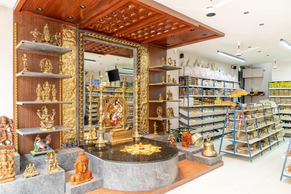
A retail store's design is doing sales work whether anyone notices it or not. Layout decides which way a customer's feet turn after they walk in. Lighting decides which product their eye lands on first. Materials and finishes decide whether the brand reads as premium, playful, or budget — often before a single price tag is read. None of that is decoration; it's store layout design and visual merchandising working together, and it's worth planning as deliberately as the shopfront sign.
Start with the customer's path through the store
The first five to ten feet inside any store is what retailers call the decompression zone — shoppers are still adjusting from the street and rarely notice displays placed right at the entrance. Keep this zone open rather than packing it with the season's biggest promotion.
Past that zone, the layout should guide movement on purpose. A grid layout — straight aisles, repeated fixtures — suits stores where shoppers come in knowing what they want, like a pharmacy or a grocery format, because it prioritises quick navigation. A loop or racetrack layout runs a defined path around the perimeter of the store, which works well for fashion and lifestyle retail because it exposes the shopper to more of the collection before they reach checkout. A free-flow layout, with fixtures placed more organically, suits boutique and high-end formats where browsing and discovery matter more than speed.
Wherever the checkout lands, keep it visible from most of the store and clear of the main exit path — a queue that blocks the door is one of the fastest ways to make a store feel smaller and more chaotic than it is.
Visual merchandising that earns a second look
"Eye level is buy level" is a retail cliché because it's consistently true — shelf and rack space at eye height gets noticed first, and that's where the products you most want to move should sit. The window or entrance display is effectively the store's advertisement to everyone walking past who hasn't come in yet, so it deserves a design refresh on its own schedule, separate from the rest of the store.
Fixtures that can be reconfigured — movable gondolas, adjustable shelving, modular rails — let a store refresh its merchandising for a new season or collection without a renovation each time. Fixed, built-in displays look sharper on day one but age faster once the product mix changes.
Lighting as a sales tool, not just illumination
Flat, even lighting across an entire store makes nothing stand out. Layered lighting — a general ambient level, plus accent or spot lighting aimed at featured products at a noticeably higher intensity — is what actually draws the eye to a display, the same principle a museum uses to spotlight an exhibit.
Colour temperature matters as much as brightness. Warmer light tends to flatter apparel, home decor, and lifestyle products and makes a space feel inviting rather than clinical. Cooler, daylight-toned light reads as clean and precise, which suits pharmacies, grocery, and electronics formats where clarity matters more than mood.
Materials and finishes that build brand identity
Flooring in a retail space takes constant foot traffic, so durability has to come first — vitrified tile or engineered stone typically outlasts softer finishes in a high-traffic format. Beyond durability, the material palette itself communicates brand positioning before a customer reads a single word: natural wood, cane, and brass read as artisanal and warm; polished concrete, black metal, and glass read as sharp and contemporary. The palette should match the story the brand is trying to tell, not just what looks good in isolation.
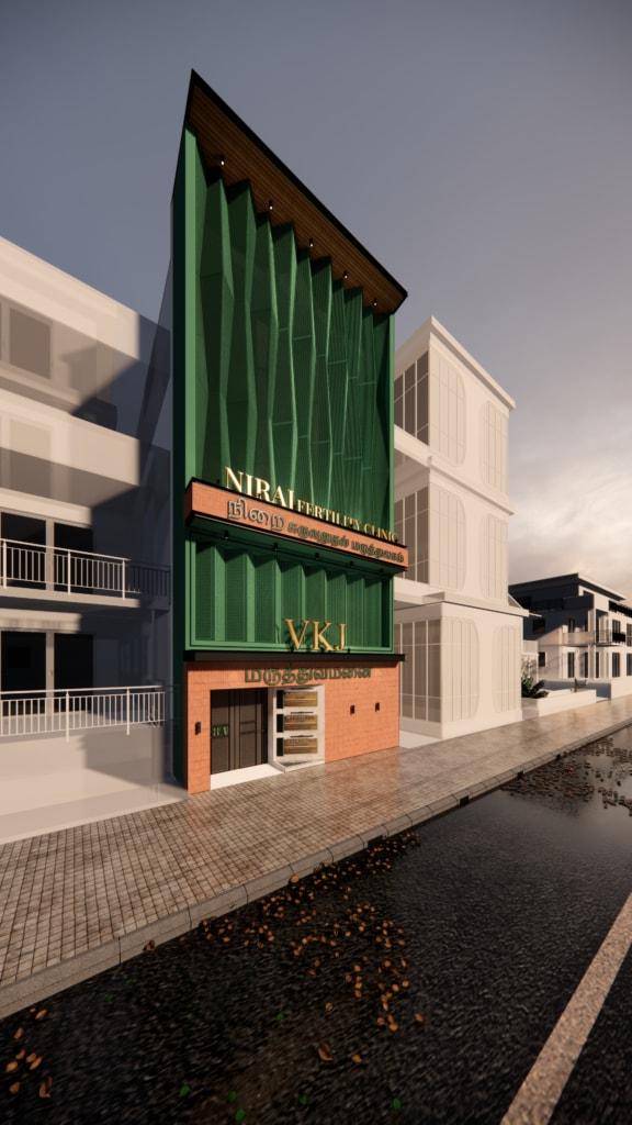
The facade deserves the same level of attention as the interior. Clear sightlines through the shopfront glazing let people see activity and product inside from the street, which measurably increases walk-ins compared to a fully closed-off frontage — the storefront is often the single highest-impact piece of retail architecture on the entire project.
Signage and wayfinding
In anything larger than a small boutique, clear category signage helps shoppers navigate without asking staff for directions, which keeps the floor feeling calm rather than crowded. Promotional and pricing signage should be placed with intent — cluttering every surface with price tags and offers undercuts the same visual merchandising work the layout and lighting are doing.
Designing for flexibility
Retail spaces change more often than almost any other interior — new collections, new seasons, new promotions. Track lighting instead of fixed downlights, modular fixtures instead of built-in casework, and a flexible base electrical plan all make it possible to refresh a store's look without touching the ceiling or the floor each time.
Mistakes worth avoiding
- Placing the season's key display right at the entrance, inside the decompression zone where it won't register
- Uniform, flat lighting with no accent layer to draw attention to featured product
- A checkout queue that spills into the main walking path or blocks the exit
- Fixed, built-in fixtures that can't adapt when the product mix or collection changes
- A closed-off shopfront that hides the store's activity from passers-by
Retail design succeeds when the layout, lighting, and materials are all pointed at the same goal — getting the right product in front of the right customer at the right moment, in a space that also happens to reflect the brand. If you're planning a new store or refitting an existing one, we'd be glad to walk through the layout and brand direction with you.
Planning a project in Chennai, Kanchipuram or Bengaluru?
Tell us about it and our team will get back with a personalised quote.
Get A Quote